The Dialog widgets
This section describes all widgets (or dialog boxes) offered by the
Dialog class. The descriptions of many of them are adapted from the
dialog(1) manual page, with the kind permission of Thomas Dickey.
Note
All unqualified method names in this section are methods of the
Dialog class. In other words, whenever a method foo() is
mentioned, you have to understand dialog.Dialog.foo().
Warning
Concerning the older widgets that have fixed defaults for the length parameters such as width and height:
Even though explicitely setting one of these length parameters to None
will not cause any error in this version, please don’t do it. If you know
the size you want, specify it directly (e.g., width=78). On the other
hand, if you want dialog to automagically figure out a suitable
size, you have two options:
either enable the autowidgetsize option and make sure not to specify the length parameter in the widget call;
or explicitely set it to
0(e.g.,width=0).
Displaying multi-line text
Message box
- Dialog.msgbox(text, height=None, width=None, **kwargs)[source]
Display a message dialog box, with scrolling and line wrapping.
- Parameters
text (str) – text to display in the box
height (int or
None) – height of the boxwidth (int or
None) – width of the box
- Returns
- Return type
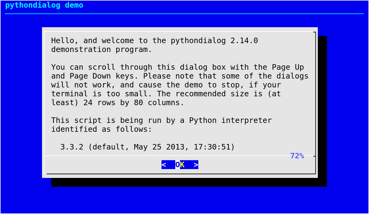
Display text in a message box, with a scrollbar and percentage indication if text is too long to fit in a single “screen”.
An
msgbox()is very similar to ayesno()box. The only difference between anmsgbox()and ayesno()box is that the former only has a single OK button. You can usemsgbox()to display any message you like. After reading the message, the user can press the Enter key so that dialog will exit and the calling program can continue its operation.msgbox()performs automatic line wrapping. If you want to force a newline at some point, simply insert it in text. In other words (with the default settings), newline characters in text are respected; the line wrapping process performed by dialog only inserts additional newlines when needed. If you want no automatic line wrapping, consider usingscrollbox().Default values for the size parameters when the autowidgetsize option is disabled:
height=10, width=30.Notable exceptions:
any exception raised by
Dialog._perform()
Text box
- Dialog.textbox(filepath, height=None, width=None, **kwargs)[source]
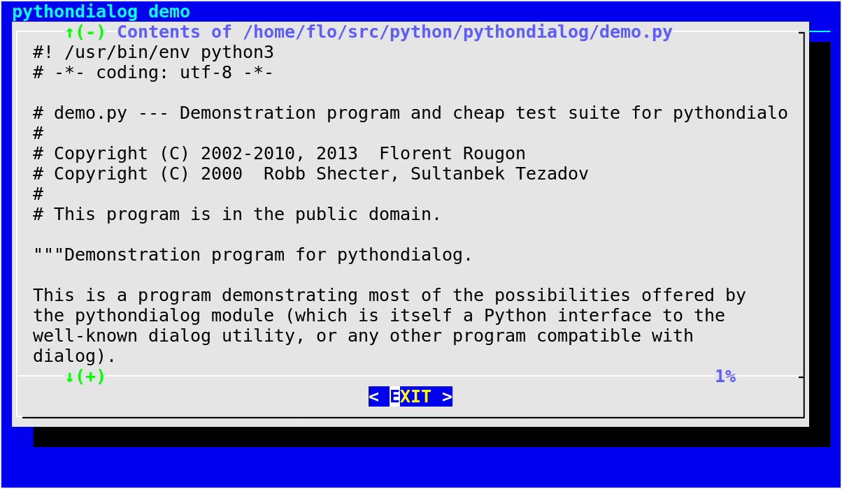
Display the contents of a file in a dialog box.
- Parameters
filepath (str) – path to a file, the contents of which is to be displayed in the box
height (int or
None) – height of the boxwidth (int or
None) – width of the box
- Returns
- Return type
A
textbox()lets you display the contents of a text file in a dialog box. It is like a simple text file viewer. The user can move through the file using the Up and Down arrow keys, Page Up and Page Down as well as the Home and End keys available on most keyboards. If the lines are too long to be displayed in the box, the Left and Right arrow keys can be used to scroll the text region horizontally. For more convenience, forward and backward search functions are also provided.Default values for the size parameters when the autowidgetsize option is disabled:
height=20, width=60.Notable exceptions:
any exception raised by
Dialog._perform()
Scroll box
- Dialog.scrollbox(text, height=None, width=None, **kwargs)[source]
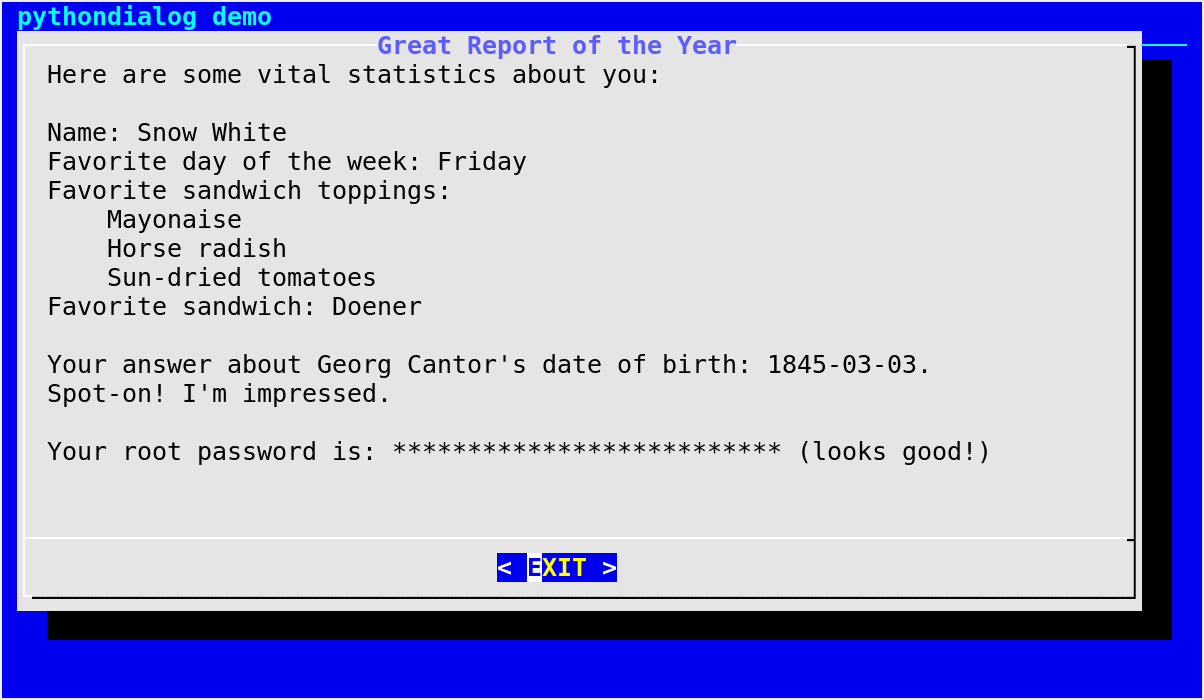
Display a string in a scrollable box, with no line wrapping.
- Parameters
text (str) – string to display in the box
height (int or
None) – height of the boxwidth (int or
None) – width of the box
- Returns
- Return type
This method is a layer on top of
textbox(). Thetextbox()widget in dialog allows one to display file contents only. This method can be used to display any text in a scrollable box. This is simply done by creating a temporary file, callingtextbox()and deleting the temporary file afterwards.The text is not automatically wrapped. New lines in the scrollable box will be placed exactly as in text. If you want automatic line wrapping, you should use the
msgbox()widget instead (thetextwrapmodule from the Python standard library is also worth knowing about).Default values for the size parameters when the autowidgetsize option is disabled:
height=20, width=78.Notable exceptions:
PythonDialogOSError(PythonDialogIOErrorif the Python version is < 3.3)Changed in version 3.1:
UnableToCreateTemporaryDirectoryexception can’t be raised anymore. The equivalent condition now raisesPythonDialogOSError.
scrollbox() example
Edit box
- Dialog.editbox(filepath, height=0, width=0, **kwargs)[source]
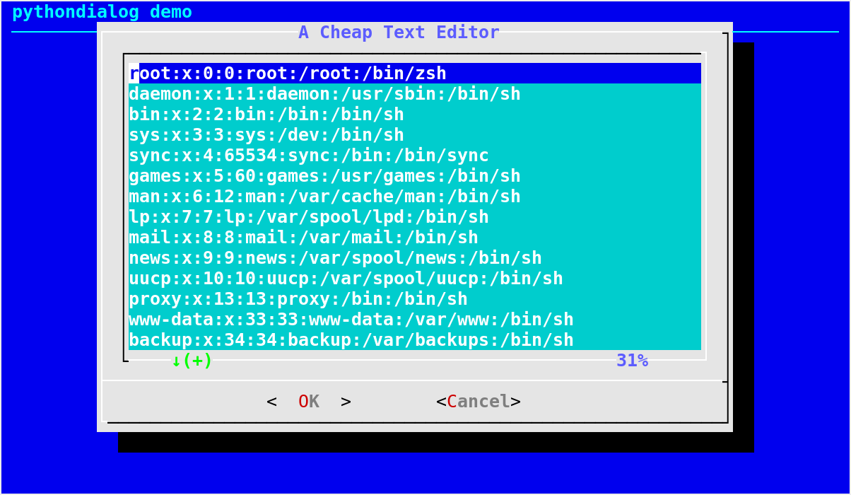
Display a basic text editor dialog box.
- Parameters
- Returns
a tuple of the form
(code, text)where:code is a Dialog exit code;
text is the contents of the text entry window on exit.
- Return type
The
editbox()dialog displays a copy of the file contents. You may edit it using the Backspace, Delete and cursor keys to correct typing errors. It also recognizes Page Up and Page Down. Unlike theinputbox(), you must tab to the OK or Cancel buttons to close the dialog. Pressing the Enter key within the box will split the corresponding line.Notable exceptions:
any exception raised by
Dialog._perform()See also
method
editbox_str()
- Dialog.editbox_str(init_contents, *args, **kwargs)[source]
Display a basic text editor dialog box (wrapper around
editbox()).- Parameters
- Returns
a tuple of the form
(code, text)where:code is a Dialog exit code;
text is the contents of the text entry window on exit.
- Return type
The
editbox_str()method is a thin wrapper aroundeditbox().editbox_str()accepts a string as its first argument, instead of a file path. That string is written to a temporary file whose path is passed toeditbox()along with the arguments specified via args and kwargs. Please refer toeditbox()’s documentation for more details.Notes:
the temporary file is deleted before the method returns;
if init_contents does not end with a newline character (
'\n'), then this method automatically adds one. This is done in order to avoid unexpected behavior resulting from the fact that, before version 1.3-20160209, dialog’s editbox widget ignored the last line of the input file unless it was terminated by a newline character.
Notable exceptions:
any exception raised by
Dialog._perform()
New in version 3.4.
See also
method
editbox()
Progress box
- Dialog.progressbox(file_path=None, file_flags=0, fd=None, text=None, height=None, width=None, **kwargs)[source]
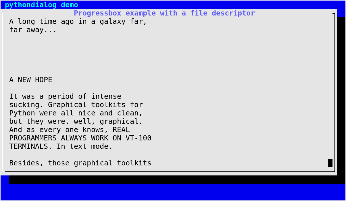
Display a possibly growing stream in a dialog box, as with
tail -f.A file, or more generally a stream that can be read from, must be specified with either:
- Parameters
file_path (str) – path to the file that is going to be displayed
file_flags – flags used when opening file_path; those are passed to
os.open()(not the built-inopen()function!). By default, only one flag is set:os.O_RDONLY.
or
- Parameters
fd (int) – file descriptor for the stream to be displayed
Remaining parameters:
- Parameters
text – caption continuously displayed at the top, above the stream text, or
Noneto disable the captionheight (int or
None) – height of the boxwidth (int or
None) – width of the box
- Returns
- Return type
Display the contents of the specified file, updating the dialog box whenever the file grows, as with the
tail -fcommand.The file can be specified in two ways:
Default values for the size parameters when the autowidgetsize option is disabled:
height=20, width=78.Notable exceptions:
PythonDialogOSError(PythonDialogIOErrorif the Python version is < 3.3)any exception raised by
Dialog._perform()
progressbox() example
Program box
- Dialog.programbox(file_path=None, file_flags=0, fd=None, text=None, height=None, width=None, **kwargs)[source]
Display a possibly growing stream in a dialog box, as with
tail -f.A
programbox()is very similar to aprogressbox(). The only difference between aprogrambox()and aprogressbox()is that aprogrambox()displays an OK button, but only after the input stream has been exhausted (i.e., End Of File has been reached).This dialog box can be used to display the piped output of an external program. After the program completes, the user can press the Enter key to close the dialog and resume execution of the calling program.
The parameters and exceptions are the same as for
progressbox(). Please refer to the corresponding documentation.Default values for the size parameters when the autowidgetsize option is disabled:
height=20, width=78.This widget requires dialog >= 1.1-20110302.
New in version 2.14.
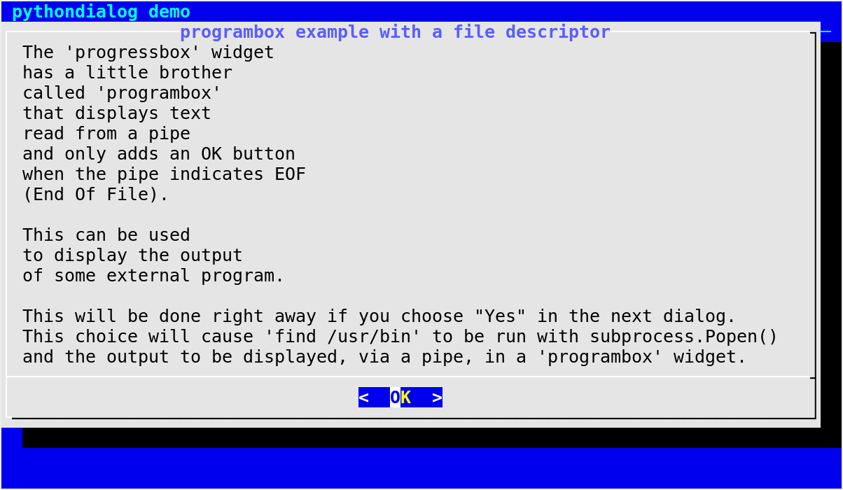
programbox() example
Tail box
- Dialog.tailbox(filepath, height=None, width=None, **kwargs)[source]
Display the contents of a file in a dialog box, as with
tail -f.- Parameters
filepath (str) – path to a file, the contents of which is to be displayed in the box
height (int or
None) – height of the boxwidth (int or
None) – width of the box
- Returns
- Return type
Display the contents of the file specified with filepath, updating the dialog box whenever the file grows, as with the
tail -fcommand.Default values for the size parameters when the autowidgetsize option is disabled:
height=20, width=60.Notable exceptions:
any exception raised by
Dialog._perform()
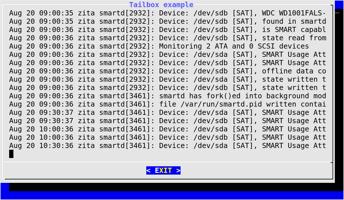
Displaying transient messages
Info box
- Dialog.infobox(text, height=None, width=None, **kwargs)[source]
Display an information dialog box.
- Parameters
text (str) – text to display in the box
height (int or
None) – height of the boxwidth (int or
None) – width of the box
- Returns
- Return type
An info box is basically a message box. However, in this case, dialog will exit immediately after displaying the message to the user. The screen is not cleared when dialog exits, so that the message will remain on the screen after the method returns. This is useful when you want to inform the user that some operations are carrying on that may require some time to finish.
Default values for the size parameters when the autowidgetsize option is disabled:
height=10, width=30.Notable exceptions:
any exception raised by
Dialog._perform()
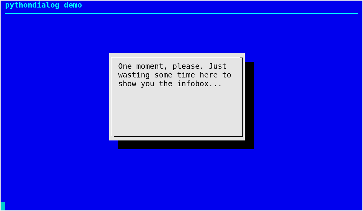
Pause
- Dialog.pause(text, height=None, width=None, seconds=5, **kwargs)[source]
Display a pause dialog box.
- Parameters
- Returns
a Dialog exit code (which is
Dialog.OKif the widget ended automatically after seconds seconds or if the user pressed the OK button)- Return type
A
pause()box displays a text and a meter along the bottom of the box, during a specified amount of time (seconds). The meter indicates how many seconds remain until the end of the pause. The widget exits when the specified number of seconds is elapsed, or immediately if the user presses the OK button, the Cancel button or the Esc key.Default values for the size parameters when the autowidgetsize option is disabled:
height=15, width=60.Notable exceptions:
any exception raised by
Dialog._perform()
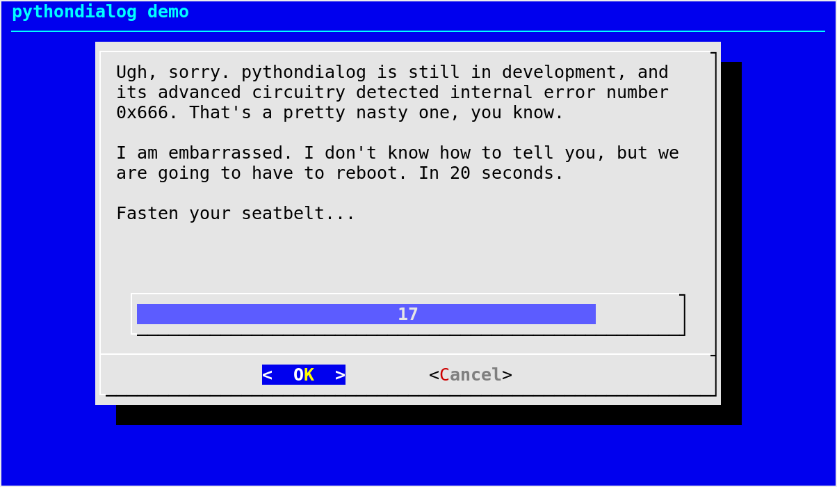
Progress meters
Regular gauge
- Dialog.gauge_start(text='', height=None, width=None, percent=0, **kwargs)[source]
Display a gauge box.
- Parameters
- Returns
undefined
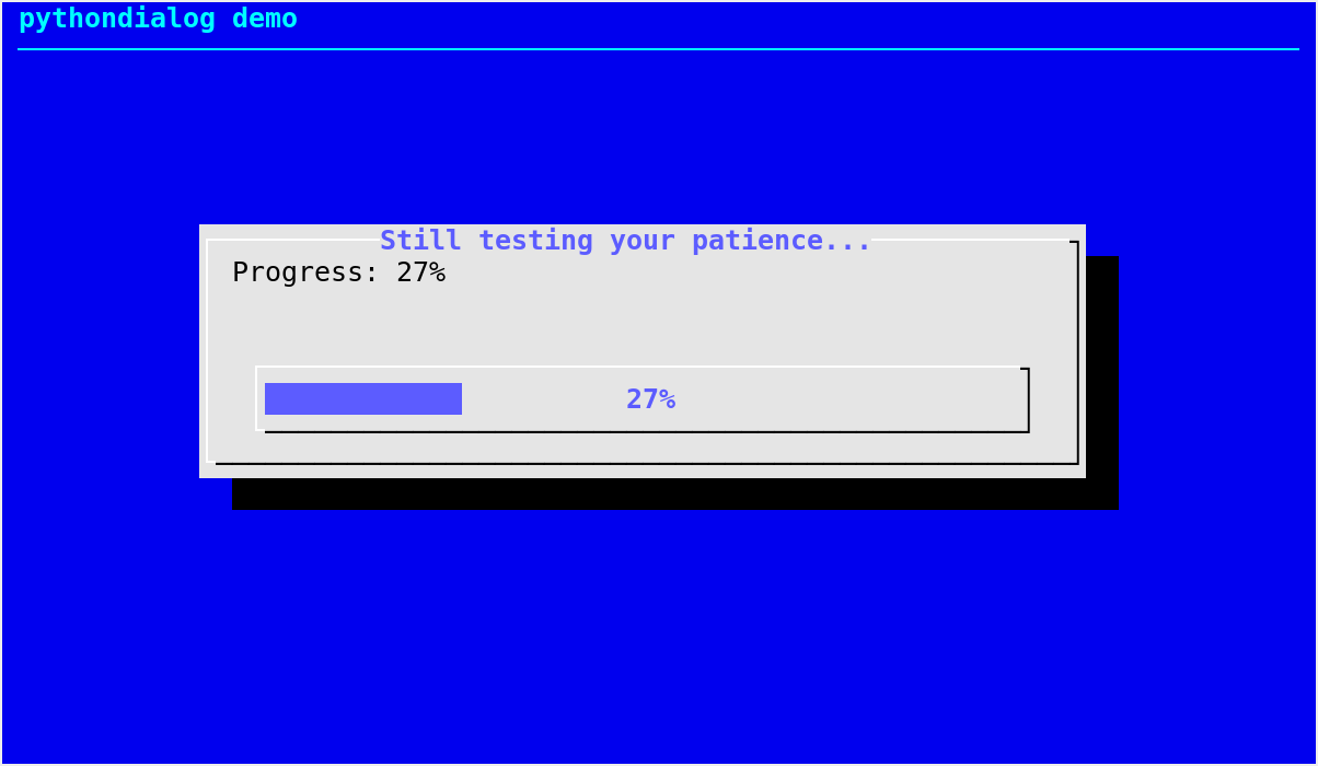
A gauge box displays a meter along the bottom of the box. The meter indicates a percentage.
This function starts the dialog-like program, telling it to display a gauge box containing a text and an initial percentage in the meter.
Gauge typical usage
Gauge typical usage (assuming that d is an instance of the
Dialogclass) looks like this:d.gauge_start() # do something d.gauge_update(10) # 10% of the whole task is done # ... d.gauge_update(100, "any text here") # work is done exit_code = d.gauge_stop() # cleanup actions
Default values for the size parameters when the autowidgetsize option is disabled:
height=8, width=54.Notable exceptions:
any exception raised by
_call_program()
- Dialog.gauge_update(percent, text='', update_text=False)[source]
Update a running gauge box.
- Parameters
- Returns
undefined
This function updates the percentage shown by the meter of a running gauge box (meaning
gauge_start()must have been called previously). If update_text isTrue, the text displayed in the box is also updated.See the
gauge_start()method documentation for information about how to use a gauge.Notable exception:
PythonDialogIOError(PythonDialogOSErrorfrom Python 3.3 onwards) can be raised if there is an I/O error while trying to write to the pipe used to talk to the dialog-like program.
- Dialog.gauge_iterate(**kwargs)[source]
Update a running gauge box.
Deprecated since version 2.03: Use
gauge_update()instead.
- Dialog.gauge_stop()[source]
Terminate a running gauge widget.
- Returns
- Return type
This function performs the appropriate cleanup actions to terminate a running gauge started with
gauge_start().See the
gauge_start()method documentation for information about how to use a gauge.Notable exceptions:
any exception raised by
_handle_program_exit();PythonDialogIOError(PythonDialogOSErrorfrom Python 3.3 onwards) can be raised if closing the pipe used to talk to the dialog-like program fails.
gauge() example
Mixed gauge
- Dialog.mixedgauge(text, height=0, width=0, percent=0, elements=[], **kwargs)[source]
Display a mixed gauge dialog box.
- Parameters
text (str) – text to display in the middle of the box, between the elements list and the progress bar
height (int) – height of the box
width (int) – width of the box
percent (int) – integer giving the percentage for the global progress bar
elements – an iterable of
(tag, item)tuples, the meaning of which is explained below
- Returns
- Return type
A
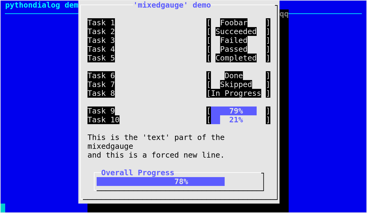
mixedgauge()box displays a list of “elements” with status indication for each of them, followed by a text and finally a global progress bar along the bottom of the box.The top part (“elements”) is suitable for displaying a task list. One element is displayed per line, with its tag part on the left and its item part on the right. The item part is a string that is displayed on the right of the same line.
The item part of an element can be an arbitrary string. Special values listed in the dialog(3) manual page are translated into a status indication for the corresponding task (tag), such as: “Succeeded”, “Failed”, “Passed”, “Completed”, “Done”, “Skipped”, “In Progress”, “Checked”, “N/A” or a progress bar.
A progress bar for an element is obtained by supplying a negative number for the item. For instance,
"-75"will cause a progress bar indicating 75% to be displayed on the corresponding line.For your convenience, if an item appears to be an integer or a float, it will be converted to a string before being passed to the dialog-like program.
text is shown as a sort of caption between the list and the global progress bar. The latter displays percent as the percentage of completion.
Contrary to the regular gauge widget,
mixedgauge()is completely static. You have to callmixedgauge()several times in order to display different percentages in the global progress bar or various status indicators for a given task.Note
Calling
mixedgauge()several times is likely to cause unwanted flickering because of the screen initializations performed by dialog on every run.Notable exceptions:
any exception raised by
Dialog._perform()
mixedgauge() example
List-like widgets
Build list
- Dialog.buildlist(text, height=0, width=0, list_height=0, items=[], **kwargs)[source]
Display a buildlist box.
- Parameters
text (str) – text to display in the box
height (int) – height of the box
width (int) – width of the box
list_height (int) – height of the selected and unselected list boxes
items – an iterable of
(tag, item, status)tuples where status specifies the initial selected/unselected state of each entry; can beTrueorFalse,1or0,"on"or"off"(True,1and"on"meaning selected), or any case variation of these two strings.
- Returns
a tuple of the form
(code, tags)where:code is a Dialog exit code;
tags is a list of the tags corresponding to the selected items, in the order they have in the list on the right.
- Return type
A
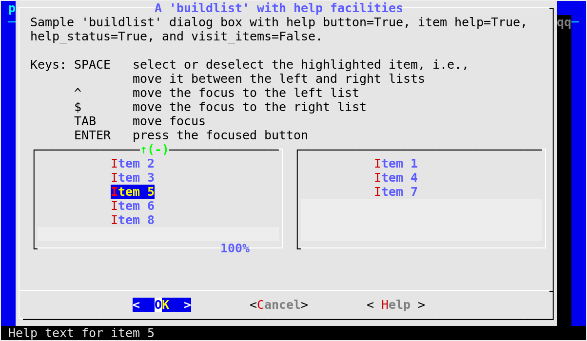
buildlist()dialog is similar in logic to thechecklist(), but differs in presentation. In this widget, two lists are displayed, side by side. The list on the left shows unselected items. The list on the right shows selected items. As items are selected or unselected, they move between the two lists. The status component of items specifies which items are initially selected.Key
Action
Space
select or deselect the highlighted item, i.e., move it between the left and right lists
^
move the focus to the left list
$
move the focus to the right list
Tab
move focus (see visit_items below)
Enter
press the focused button
If called with
visit_items=True, the Tab key can move the focus to the left and right lists, which is probably more intuitive for users than the default behavior that requires using ^ and $ for this purpose.This widget requires dialog >= 1.2-20121230.
Notable exceptions:
any exception raised by
Dialog._perform()or_to_onoff()New in version 3.0.
buildlist() example
Check list
- Dialog.checklist(text, height=None, width=None, list_height=None, choices=[], **kwargs)[source]
Display a checklist box.
- Parameters
text (str) – text to display in the box
height (int or
None) – height of the boxwidth (int or
None) – width of the boxlist_height (int or
None) – number of entries displayed in the box at a given time (the contents can be scrolled)choices – an iterable of
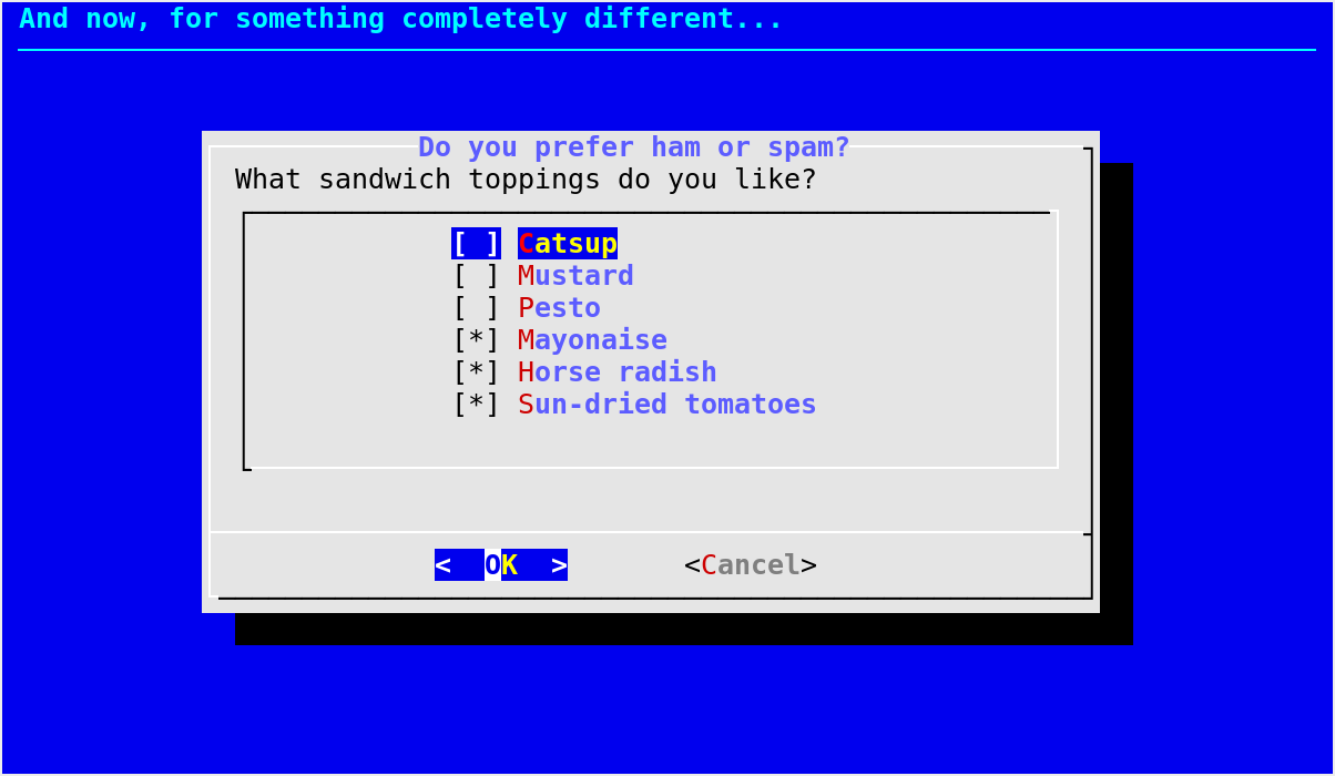
(tag, item, status)tuples where status specifies the initial selected/unselected state of each entry; can beTrueorFalse,1or0,"on"or"off"(True,1and"on"meaning selected), or any case variation of these two strings.
- Returns
a tuple of the form
(code, [tag, ...])whose first element is a Dialog exit code and second element lists all tags for the entries selected by the user. If the user exits with Esc or Cancel, the returned tag list is empty.- Return type
Default values for the size parameters when the autowidgetsize option is disabled:
height=15, width=54, list_height=7.Notable exceptions:
any exception raised by
Dialog._perform()or_to_onoff()
checklist() example
Radio list
- Dialog.radiolist(text, height=None, width=None, list_height=None, choices=[], **kwargs)[source]
Display a radiolist box.
- Parameters
text (str) – text to display in the box
height (int or
None) – height of the boxwidth (int or
None) – width of the boxlist_height (int or
None) – number of entries displayed in the box (which can be scrolled) at a given timechoices – an iterable of
(tag, item, status)tuples where status specifies the initial selected/unselected state of each entry; can beTrueorFalse,1or0,"on"or"off"(True,1and"on"meaning selected), or any case variation of these two strings. No more than one entry should be set toTrue.
- Returns
a tuple of the form
(code, tag)where:code is a Dialog exit code;
tag is the tag string corresponding to the entry that was chosen by the user.
- Return type
A
radiolist()box is similar to amenu()box. The main differences are presentation and that theradiolist()allows you to indicate which entry is initially selected, by setting its status toTrue.If the user exits with Esc or Cancel, or if all entries were initially set to
Falseand not altered before the user chose OK, the returned tag is the empty string.Default values for the size parameters when the autowidgetsize option is disabled:
height=15, width=54, list_height=7.Notable exceptions:
any exception raised by
Dialog._perform()or_to_onoff()
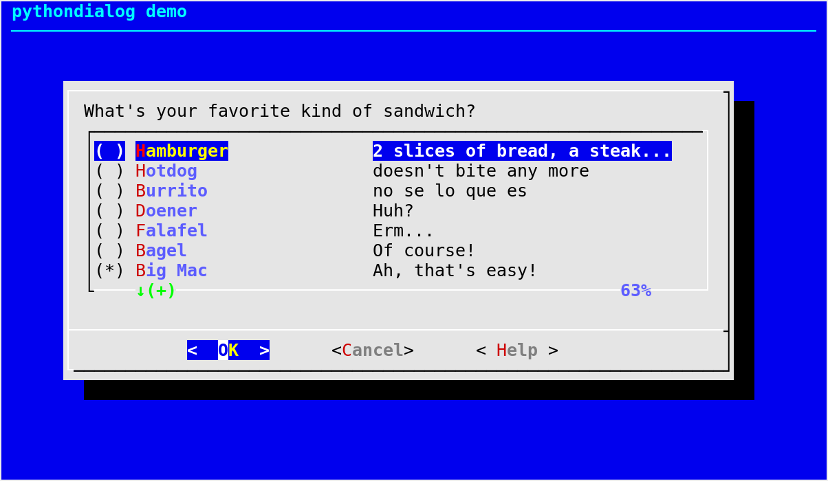
radiolist() example
Tree view
- Dialog.treeview(text, height=0, width=0, list_height=0, nodes=[], **kwargs)[source]
Display a treeview box.
- Parameters
text (str) – text to display at the top of the box
height (int) – height of the box
width (int) – width of the box
list_height (int) – number of lines reserved for the main part of the box, where the tree is displayed
nodes –
an iterable of
(tag, item, status, depth)tuples describing nodes, where:tag is used to indicate which node was selected by the user on exit;
item is the text displayed for the node;
status specifies the initial selected/unselected state of each entry; can be
TrueorFalse,1or0,"on"or"off"(True,1and"on"meaning selected), or any case variation of these two strings;depth is a non-negative integer indicating the depth of the node in the tree (
0for the root node).
- Returns
a tuple of the form
(code, tag)where:code is a Dialog exit code;
tag is the tag of the selected node.
Display nodes organized in a tree structure. Each node has a tag, an item text, a selected status, and a depth in the tree. Only the item texts are displayed in the widget; tags are only used for the return value. Only one node can be selected at a given time, as for the
radiolist()widget.This widget requires dialog >= 1.2-20121230.
Notable exceptions:
any exception raised by
Dialog._perform()or_to_onoff()New in version 2.14.
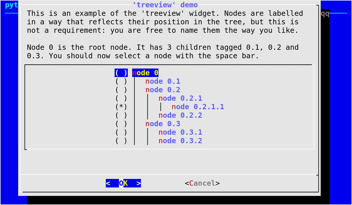
treeview() example
Single-line input fields
Input box
- Dialog.inputbox(text, height=None, width=None, init='', **kwargs)[source]
Display an input dialog box.
- Parameters
- Returns
a tuple of the form
(code, string)where:code is a Dialog exit code;
string is the string entered by the user.
- Return type
An input box is useful when you want to ask questions that require the user to input a string as the answer. If init is supplied, it is used to initialize the input string. When entering the string, the Backspace key can be used to correct typing errors. If the input string is longer than can fit in the dialog box, the input field will be scrolled.
Default values for the size parameters when the autowidgetsize option is disabled:
height=10, width=30.Notable exceptions:
any exception raised by
Dialog._perform()
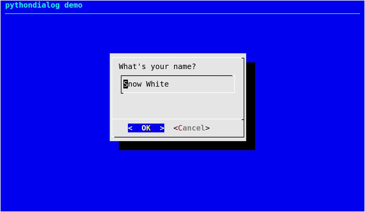
inputbox() example
Password box
- Dialog.passwordbox(text, height=None, width=None, init='', **kwargs)[source]
Display a password input dialog box.
- Parameters
- Returns
a tuple of the form
(code, password)where:code is a Dialog exit code;
password is the password entered by the user.
- Return type
A
passwordbox()is similar to aninputbox(), except that the text the user enters is not displayed. This is useful when prompting for passwords or other sensitive information. Be aware that if anything is passed in init, it will be visible in the system’s process table to casual snoopers. Also, it is very confusing to the user to provide them with a default password they cannot see. For these reasons, using init is highly discouraged.By default (as in dialog), nothing is echoed to the terminal as the user enters the sensitive text. This can be confusing to users. Use
insecure=True(keyword argument) if you want an asterisk to be echoed for each character entered by the user.Default values for the size parameters when the autowidgetsize option is disabled:
height=10, width=60.Notable exceptions:
any exception raised by
Dialog._perform()
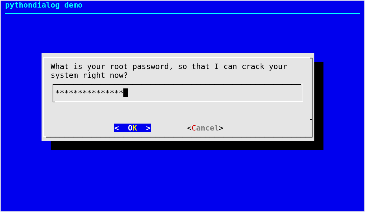
passwordbox() example
Forms
Form
- Dialog.form(text, elements, height=0, width=0, form_height=0, **kwargs)[source]
Display a form consisting of labels and fields.
- Parameters
- Returns
a tuple of the form
(code, list)where:code is a Dialog exit code;
list gives the contents of every editable field on exit, with the same order as in elements.
- Return type
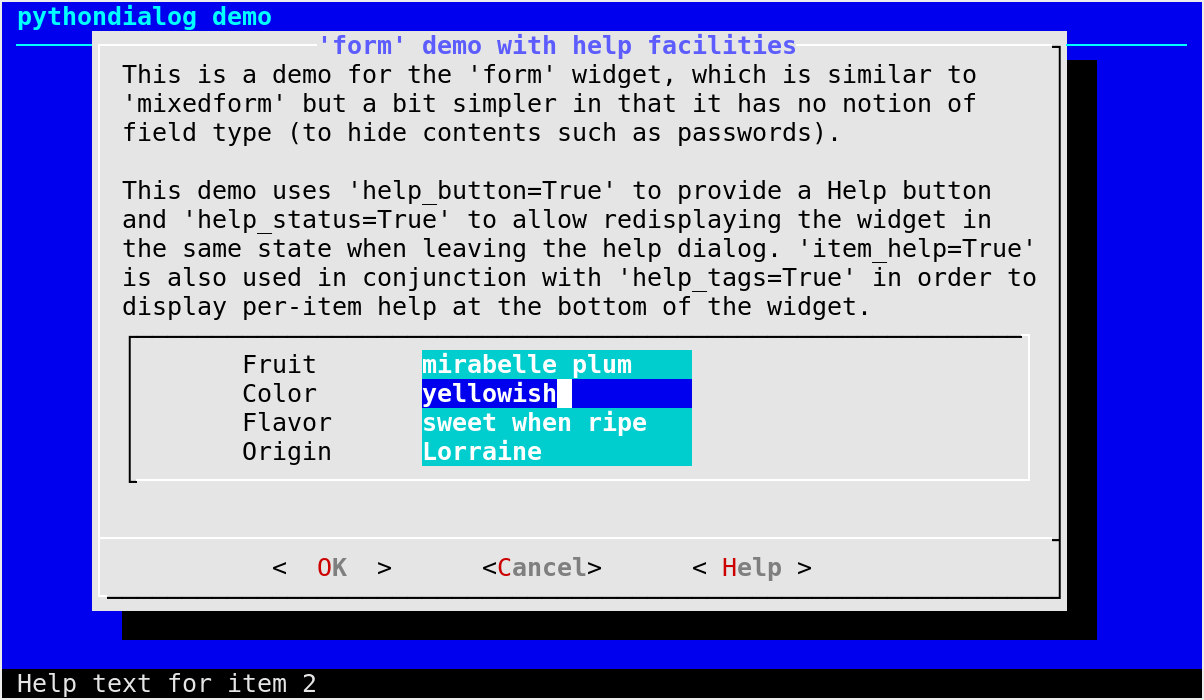
A
form()box consists in a series of fields and associated labels. This type of dialog is suitable for adjusting configuration parameters and similar tasks.Each element of elements must itself be a sequence
(label, yl, xl, item, yi, xi, field_length,
input_length)
containing the various parameters concerning a given field and the associated label.label is a string that will be displayed at row yl, column xl. item is a string giving the initial value for the field, which will be displayed at row yi, column xi (row and column numbers starting from 1).
field_length and input_length are integers that respectively specify the number of characters used for displaying the field and the maximum number of characters that can be entered for this field. These two integers also determine whether the contents of the field can be modified, as follows:
if field_length is zero, the field cannot be altered and its contents determines the displayed length;
if field_length is negative, the field cannot be altered and the opposite of field_length gives the displayed length;
if input_length is zero, it is set to field_length.
Notable exceptions:
any exception raised by
Dialog._perform()
Mixed form
- Dialog.mixedform(text, elements, height=0, width=0, form_height=0, **kwargs)[source]
Display a form consisting of labels and fields.
- Parameters
- Returns
a tuple of the form
(code, list)where:code is a Dialog exit code;
list gives the contents of every field on exit, with the same order as in elements.
- Return type
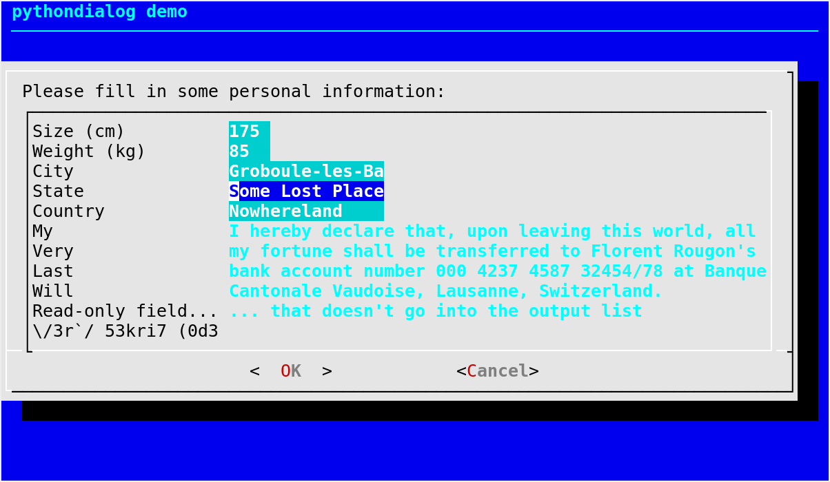
A
mixedform()box is very similar to aform()box, and differs from the latter by allowing field attributes to be specified.Each element of elements must itself be a sequence
(label, yl, xl, item, yi, xi, field_length,
input_length, attributes)
containing the various parameters concerning a given field and the associated label.attributes is an integer interpreted as a bit mask with the following meaning (bit 0 being the least significant bit):
Bit number
Meaning
0
the field should be hidden (e.g., a password)
1
the field should be read-only (e.g., a label)
For all other parameters, please refer to the documentation of the
form()box.The return value is the same as would be with the
form()box, except that fields marked as read-only with bit 1 of attributes are also included in the output list.Notable exceptions:
any exception raised by
Dialog._perform()
mixedform() example
Password form
- Dialog.passwordform(text, elements, height=0, width=0, form_height=0, **kwargs)[source]
Display a form consisting of labels and invisible fields.
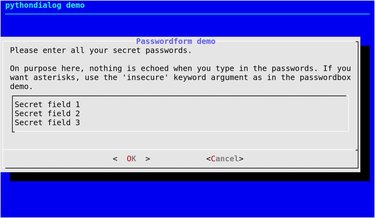
This widget is identical to the
form()box, except that all text fields are treated aspasswordbox()widgets rather thaninputbox()widgets.By default (as in dialog), nothing is echoed to the terminal as the user types in the invisible fields. This can be confusing to users. Use
insecure=True(keyword argument) if you want an asterisk to be echoed for each character entered by the user.Notable exceptions:
any exception raised by
Dialog._perform()
passwordform() example
Selecting files and directories
Directory selection
- Dialog.dselect(filepath, height=0, width=0, **kwargs)[source]
Display a directory selection dialog box.
- Parameters
- Returns
a tuple of the form
(code, path)where:code is a Dialog exit code;
path is the directory chosen by the user.
- Return type
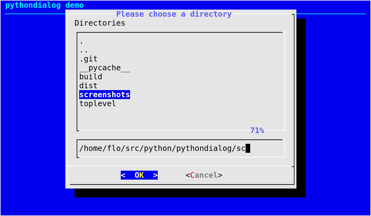
The directory selection dialog displays a text entry window in which you can type a directory, and above that a window with directory names.
Here, filepath can be a path to a file, in which case the directory window will display the contents of the path and the text entry window will contain the preselected directory.
Use Tab or the arrow keys to move between the windows. Within the directory window, use the Up and Down arrow keys to scroll the current selection. Use the Space bar to copy the current selection into the text entry window.
Typing any printable character switches focus to the text entry window, entering that character as well as scrolling the directory window to the closest match.
Use Enter or the OK button to accept the current value in the text entry window and exit.
Notable exceptions:
any exception raised by
Dialog._perform()
File or directory selection
- Dialog.fselect(filepath, height=0, width=0, **kwargs)[source]
Display a file selection dialog box.
- Parameters
- Returns
a tuple of the form
(code, path)where:code is a Dialog exit code;
path is the path chosen by the user (the last element of which may be a directory or a file).
- Return type
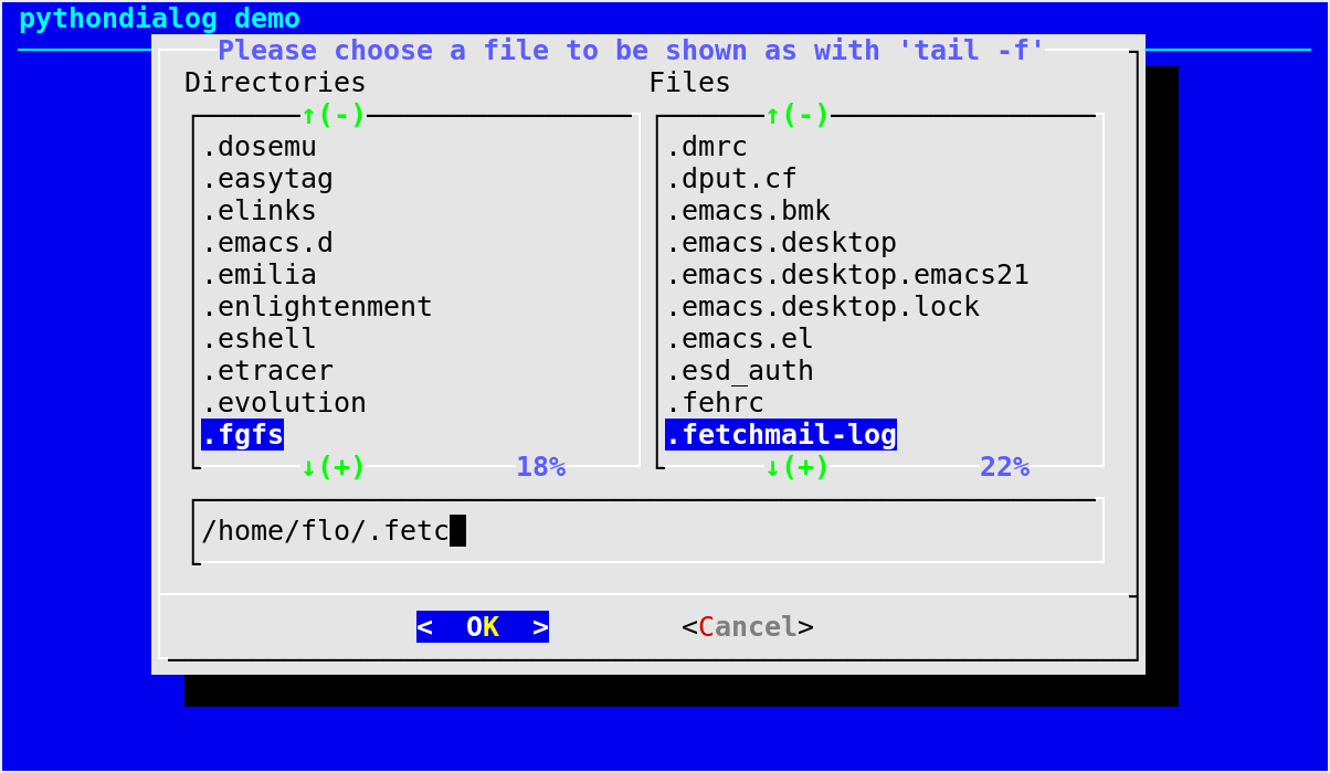
The file selection dialog displays a text entry window in which you can type a file name (or directory), and above that two windows with directory names and file names.
Here, filepath can be a path to a file, in which case the file and directory windows will display the contents of the path and the text entry window will contain the preselected file name.
Use Tab or the arrow keys to move between the windows. Within the directory or file name windows, use the Up and Down arrow keys to scroll the current selection. Use the Space bar to copy the current selection into the text entry window.
Typing any printable character switches focus to the text entry window, entering that character as well as scrolling the directory and file name windows to the closest match.
Use Enter or the OK button to accept the current value in the text entry window, or the Cancel button to cancel.
Notable exceptions:
any exception raised by
Dialog._perform()
Date and time
Calendar
- Dialog.calendar(text, height=None, width=0, day=- 1, month=- 1, year=- 1, **kwargs)[source]
Display a calendar dialog box.
- Parameters
- Returns
a tuple of the form
(code, date)where:code is a Dialog exit code;
date is a list of the form
[day, month,
year]
, where day, month and year are integers corresponding to the date chosen by the user.
- Return type
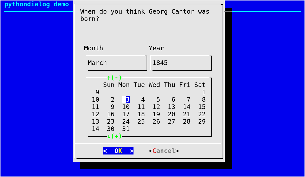
A
calendar()box displays day, month and year in separately adjustable windows. If year is given as0, the current date is used as initial value; otherwise, if any of the values for day, month and year is negative, the current date’s corresponding value is used. You can increment or decrement any of those using the Left, Up, Right and Down arrows. Use Tab or Backtab to move between windows.Default values for the size parameters when the autowidgetsize option is disabled:
height=6, width=0.Notable exceptions:
any exception raised by
Dialog._perform()
Changed in version 3.2: The default values for day, month and year have been changed from
0to-1.
calendar() example
Time box
- Dialog.timebox(text, height=None, width=None, hour=- 1, minute=- 1, second=- 1, **kwargs)[source]
Display a time dialog box.
- Parameters
- Returns
a tuple of the form
(code, time)where:code is a Dialog exit code;
time is a list of the form
[hour, minute,
second]
, where hour, minute and second are integers corresponding to the time chosen by the user.
- Return type
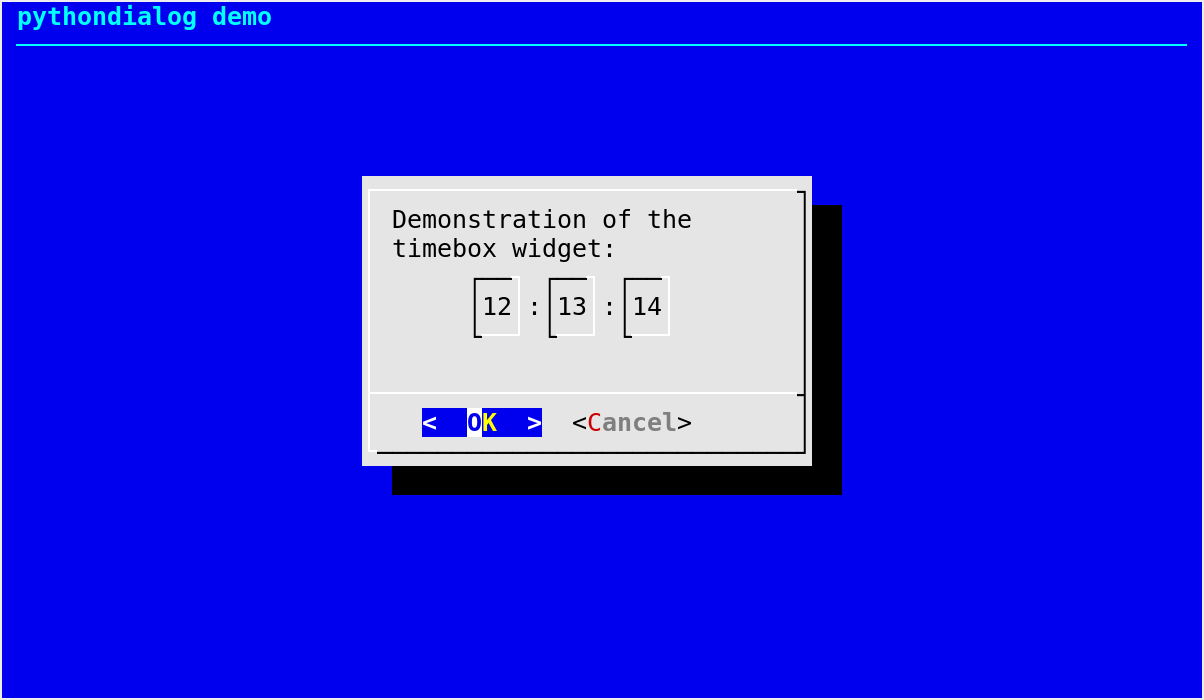
timebox()is a dialog box which allows one to select an hour, minute and second. If any of the values for hour, minute and second is negative, the current time’s corresponding value is used. You can increment or decrement any of those using the Left, Up, Right and Down arrows. Use Tab or Backtab to move between windows.Default values for the size parameters when the autowidgetsize option is disabled:
height=3, width=30.Notable exceptions:
any exception raised by
Dialog._perform()
Miscellaneous
Range box
- Dialog.rangebox(text, height=0, width=0, min=None, max=None, init=None, **kwargs)[source]
Display a range dialog box.
- Parameters
- Returns
a tuple of the form
(code, val)where:code is a Dialog exit code;
val is an integer: the value chosen by the user.
- Return type
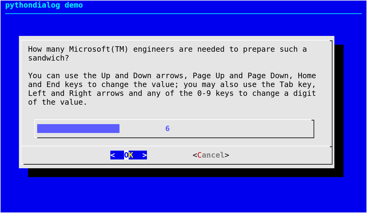
The
rangebox()dialog allows the user to select from a range of integers using a kind of slider. The range control shows the current value as a bar (like the gauge dialog).The Tab and arrow keys move the cursor between the buttons and the range control. When the cursor is on the latter, you can change the value with the following keys:
Key
Action
Left and Right arrows
select a digit to modify
+ / -
increment/decrement the selected digit by one unit
0–9
set the selected digit to the given value
Some keys are also recognized in all cursor positions:
Key
Action
Home / End
set the value to its minimum or maximum
Page Up / Page Down
decrement/increment the value so that the slider moves by one column
This widget requires dialog >= 1.2-20121230.
Notable exceptions:
any exception raised by
Dialog._perform()New in version 2.14.
rangebox() example
Yes/No
- Dialog.yesno(text, height=None, width=None, **kwargs)[source]
Display a yes/no dialog box.
- Parameters
text (str) – text to display in the box
height (int or
None) – height of the boxwidth (int or
None) – width of the box
- Returns
- Return type
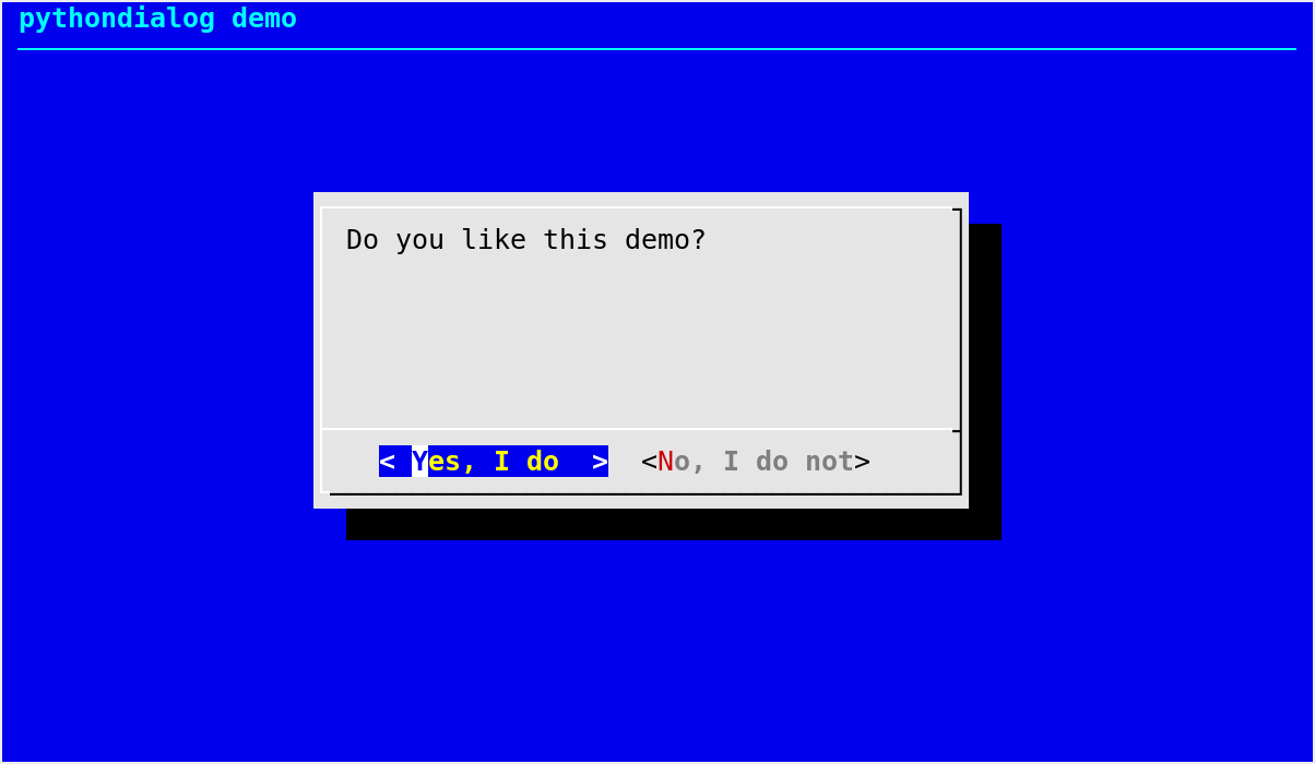
Display a dialog box containing text and two buttons labelled Yes and No by default.
The box size is height rows by width columns. If text is too long to fit in one line, it will be automatically divided into multiple lines at appropriate places. text may also contain the substring
"\n"or newline characters to control line breaking explicitly.This
yesno()dialog box is useful for asking questions that require the user to answer either “yes” or “no”. These are the default button labels, however they can be freely set with theyes_labelandno_labelkeyword arguments. The user can switch between the buttons by pressing the Tab key.Default values for the size parameters when the autowidgetsize option is disabled:
height=10, width=30.Notable exceptions:
any exception raised by
Dialog._perform()
